


[display-name-category]
[post_author]
“Build it and they will come” may have worked for Kevin Costner in Field of Dreams, but when it comes to your small business website, this is a sure-fire strategy for failure.
The number of things to consider when building a new website can be overwhelming for many small business owners. Thanks to technology we’re spoilt for choice when it comes to the tools available to build a website, maybe even a little too much so.
For non-web-savvy users, the sheer volume of options available can make it tough to find even a starting point from which to initiate the undertaking of building a small business website.
As a small business owner, you know your industry and your marketplace. You know what it takes to make it and you know that the right website design can help you spread your message, services, and products to a larger audience and bring in new business.
But, undertaking a new website design can be a daunting and disastrous ordeal if not executed correctly. Poor execution can leave you with a website that not only fails to contribute to your business growth but in certain cases and negatively affects the first impression people form about your business.
While it’s often said that your homepage is the most important page you’ll ever build, I prefer to take the point of view that every public-facing web page is important because every page on your website is a landing page. Whether visitors arrive via a paid advertising campaign, inbound link or search engine every page they land on should have been constructed to fulfill a certain goal.
So, with that in mind let’s dig into a few of the items you should always consider when building your company website to avoid the common pitfalls of DIY web design which include:
-
Putting urgency over understanding your audience.
-
Web sites that are over-designed (yes, there’s such a thing).
-
No clear calls to action.
-
Not choosing the right partner/s.
-
Outdated or inaccurate information.
-
Trying to target everyone.
Now that you know what the potential hazards are, I would like to offer some advice on how to avoid them.
Important Things to Consider During Pre-production
Allow Time to Understand Your Audience
By allowing sufficient time for adequate planning, you can avoid a very common mistake made by business owners eager to take their companies online; Putting urgency over understanding your audience.
By adopting a “just get it done” attitude and neglecting to do your homework for your potential consumers, you’re effectively building your house on the sand, without a solid foundation for customer acquisition.
Understanding who you are building the website for (and why) before undertaking a project will help make successive decisions easier. By getting to know your audience, you’re in a better position to create useful resources, attractive offers, and effective calls-to-action which have a higher chance of converting browsers into buyers.
An obvious example would be designing a website for the elderly. Failing to consider your audience prior to development could result in a website design that provides a poor user experience. You can accomplish this by using overly complicated navigation systems that users don’t understand, poor colors, contrast, and insufficiently large fonts which make your content difficult to read, etc.
Focus on the User Experience
By putting a focus on the user experience, you’re forced to consider the impact of your design decisions on the end-user. Thereby minimizing the chances of having an overly designed website that fails to make a positive contribution to your business.
By doing this, you’ll quickly realize that good design is not measured by how many fancy scripts and effects you have, but by how simply and effectively you can deliver what your users are looking for when they visit your site.
When it comes to small business websites, your users are most likely looking for information that can help them make purchasing decisions. Strive to give it to them in the simplest and easiest way possible. Also, make it easy for a user to request more information via phone or email if they cannot find what they are looking for.
That covers two of the biggest pitfalls that business owners often make when planning a new website. By failing to plan adequately or understand your audience, you’ll be setting yourself and your company up for an uphill battle when it comes to customer acquisition. Lack of understanding makes it difficult to create impactful, meaningful designs or enticing calls-to-action and offers that can drive users to take action.
Important Things to Consider During Production
With regards to the actual design of your new company website, the options are seemingly endless. But I believe your chances of creating a good website that contributes to your organizational goals is simplified if you remember the following web design-related tips.
Use What You’ve Got and Let the Pros Handle the Rest
In my experience, very few small businesses have the full complement of design assets or something resembling an IP manual required to build a thorough brief.
Take stock of what you can contribute to production in terms of logo designs, color palettes, fonts, and content and allow your design partner to flesh out the rest.
It’s also a good idea to share a list of sites you like and elaborate on why to give the designers a complete view of what you have in mind for your company website. Likewise, if there are any fonts, colors, or design elements that you don’t like, be sure to highlight those as well to prevent them from finding their way into your new website design.
For Every Page on Your Website, Provide a Clear and Concise Headline
Let users know where they are and what they can expect to find. Cover one topic per page. Bonus points for including relevant keywords in your copy and page titles and using the proper HTML heading tags.
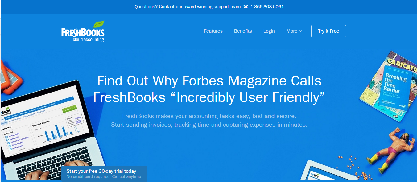
FreshBooks a great example of how to create an engaging headline. FreshBooks combines a bold headline with elements of social proof to get buy-in from prospects, as well as an informative sub-headline that explains the product offering in more detail.
Reinforce Your Headline With a Meaningful Sub-Headline
Use your headline to grab the user’s attention and sub-headlines to keep them engaged or drive home your point. E.g. Selling a major benefit of your product or service in the headline, use your sub-headline to elaborate.
Citing FreshBooks as an example again. Because they have decided to use the headline for demonstrating social proof of their product’s effectiveness, FreshBooks also includes a descriptive sub-headline that is also benefits-focused and directly related to the headline.
Focus on Benefits First
Many small business websites make the mistake of leading with a list of features and technical data. While this is good content to include, users ultimately want to know what’s in it for them and if the product or service is right for them. Once further along in their decision-making process, they will make use of feature lists to compare, evaluate, and research further.
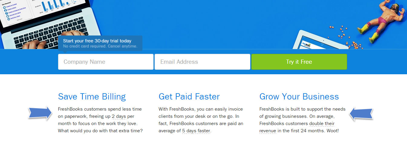
Looking at the second part of the FreshBooks Homepage, it’s easy to see the benefits of using their product. The interesting thing to note is that FreshBooks continue to utilize elements of social proof amplifying its benefits statements. This social proof serves to substantiate the product’s claimed benefits.
Create Effective Calls-To-Action
By knowing your users, their interests, and understanding their common pain points you’re in a great position to create more effective calls to action that are more relevant to your users. This relevance combined with a good, often time-sensitive offer, can be great for conversions.
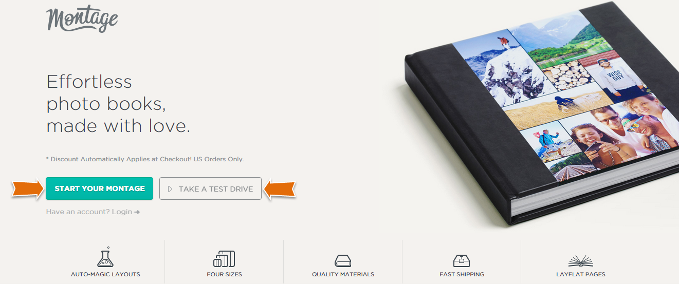
The Montage photo books website is a great example of using two core Call-to-Action elements. One allows users to dive right in and begin creating a Montage, the other offers a risk-free trial. Notice how your attention is drawn to the “Start Your Montage” button, this is done on purpose.
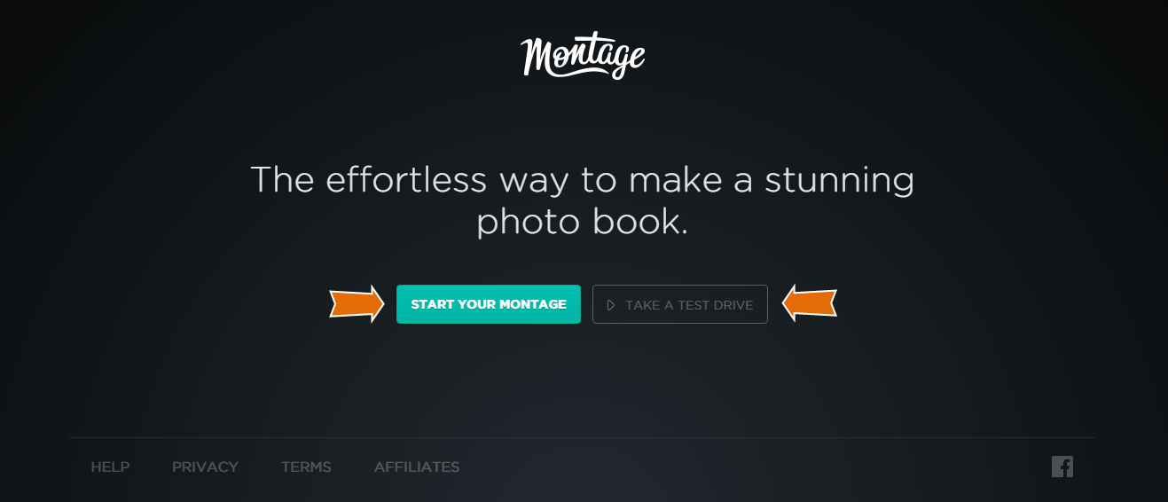
Further down the page, Montage makes use of the same two buttons, but position the offer slightly differently.
Provide a Summary of Features
It’s a good thing to provide users with information about your products and services, but don’t alienate them by making it tough to read or overly detailed and difficult to digest. Provide a features summary and then provide a way for users to drill down further into the page or site for additional details or request more information if they require it.
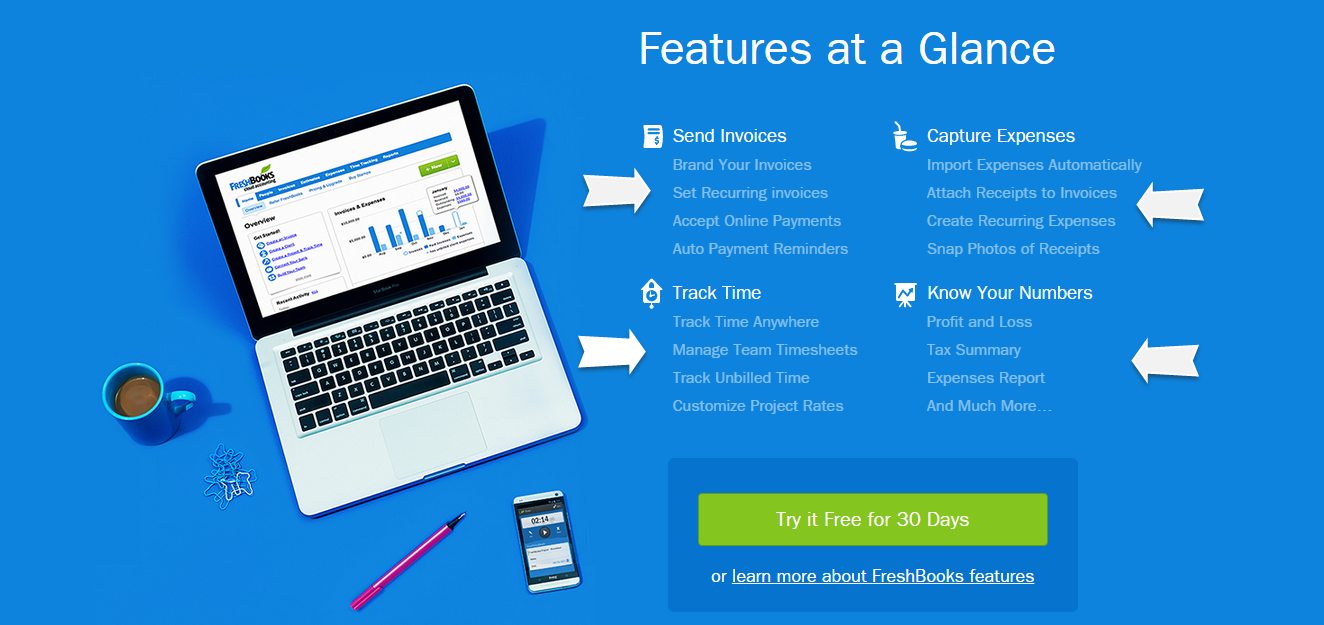
When it comes to providing a summary of features, I feel like the FreshBooks site has done it again. Here they provide a section entitled “Features at a Glance” which is a brilliant way to let users see a summary of the top features the product offers. This section also allows users to drill down into each of the top features for more information.
Demonstrate Social Proof
For many users, the experience of others will have an important impact on their decision-making process. So, don’t rely solely on your content to demonstrate the value of your service or product offers.
Make use of elements of social proof such as testimonials, accreditations, or your track record to highlight to prospects that your company is not the only one who believes in what you have to offer. Testimonials have always been important and will continue to be.
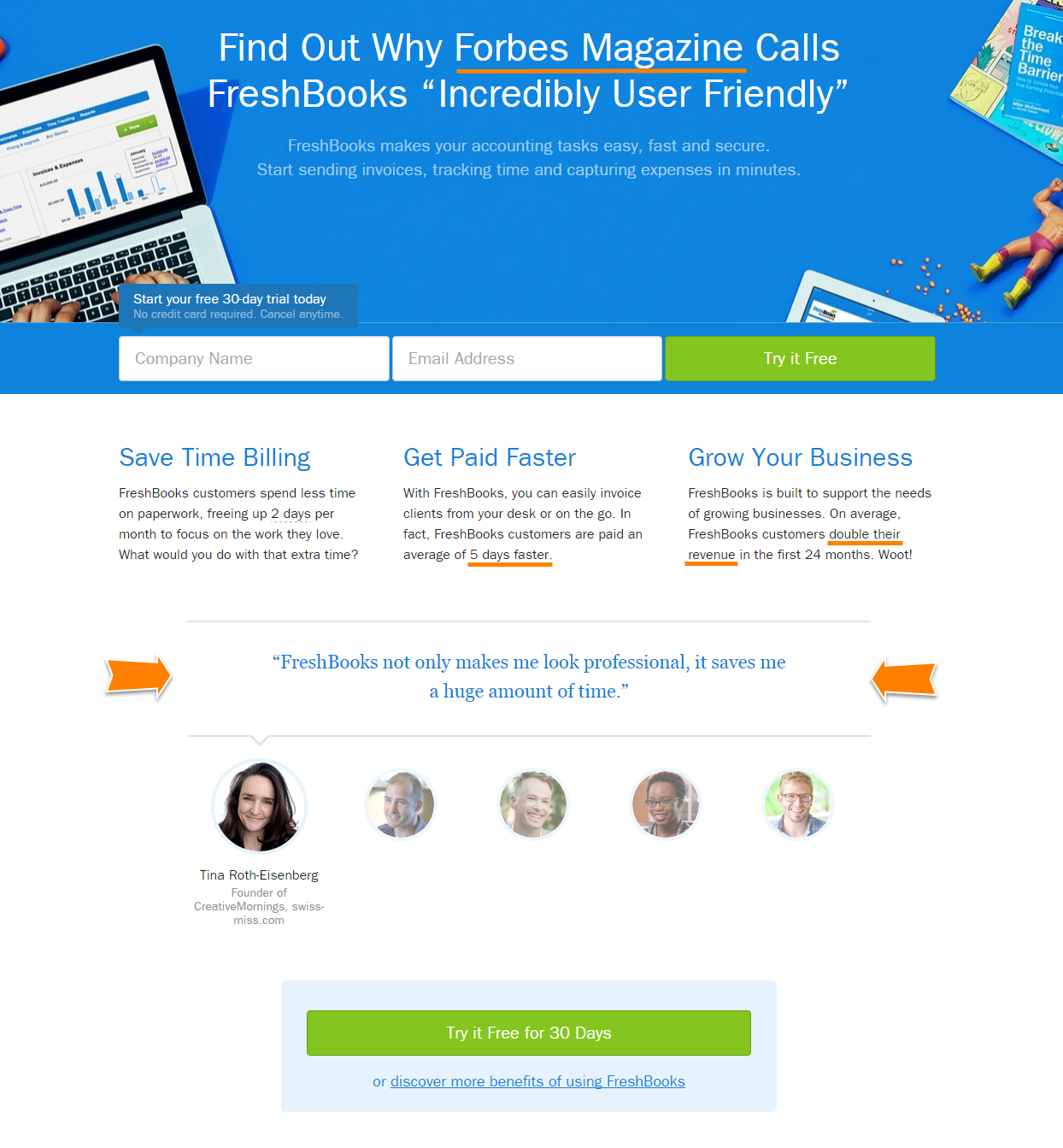
Looking at the FreshBooks site again, it’s easy to see how they make use of the elements of social proof to demonstrate to users that they’re not the only ones who believe that their products are great. Additional props for also using social proof to substantiate their benefits statements.
Provide a Standard, Intuitive Navigation
Unless you’re designing a specific type of website, stay away from overly complicated navigation systems. Provide your users with a simple, easy-to-use navigation system that facilitates website exploration and helps your users to find what they are looking for easily.
Many great websites fall short in achieving their full potential because of poor navigation. If users find using your website frustrating or confusing, you can be sure that they won’t hang around for long, they will simply exit your website and seek the information they need somewhere else.
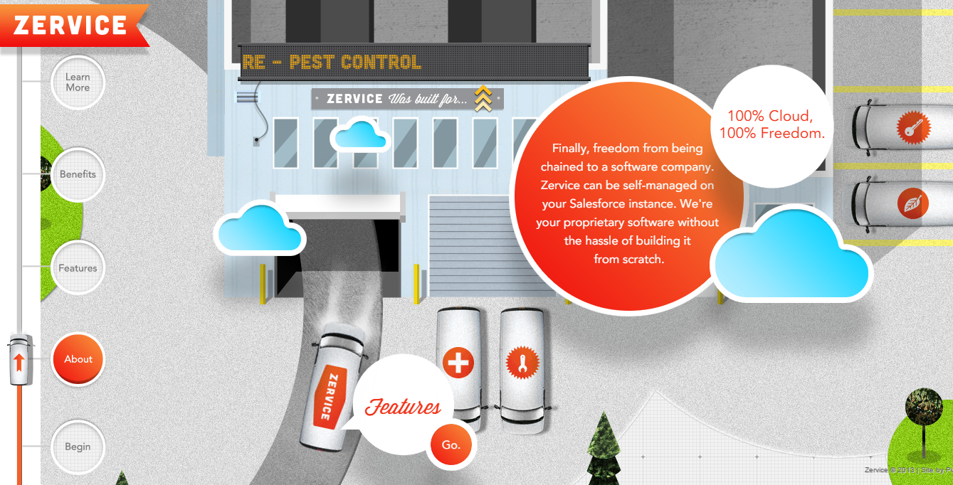
In this example, Zervice makes use of a unique navigation system and website design that allows for a ‘browsing adventure’. Impressive, but it may fall short on usability if this site was not aimed a tech-savvy prospect.
Use Supporting Imagery and Graphics
It is said that a picture is worth a thousand words and nowhere is this truer than on your website.
Use imagery to convey tone, emotion, and details relevant to the page users are on and thereby improve the user experience. Where possible make use of quality, original images rather than stock images as overly professional stock images can make a website feel less authentic to users. Similarly, avoid the use of blurry, low-quality images as these can also ruin your chances of making a favorable impression on users.
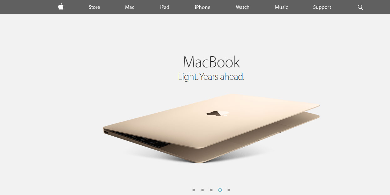
The one site that absolutely should be used as an example when discussing the use of imagery and supporting graphics is Apple. Apple makes use of beautiful product images in an otherwise very boring design to create a website that is clean, rich, and very usable. The pictures help users see the product details and as such facilitate decision making and the conversion process.
Employ Multiple Offers (Lead Generation, Click Through Pages, Etc.)
While it’s important to have one main Call-to-Action on every page, it’s equally important to include variations as secondary calls to action. If your page has a bold call-to-action that is focused on benefits, try a secondary call to action in the footer that is more feature-focused, or prompts users to contact your company for more information. This gives you a second chance to get them into your sales funnel.
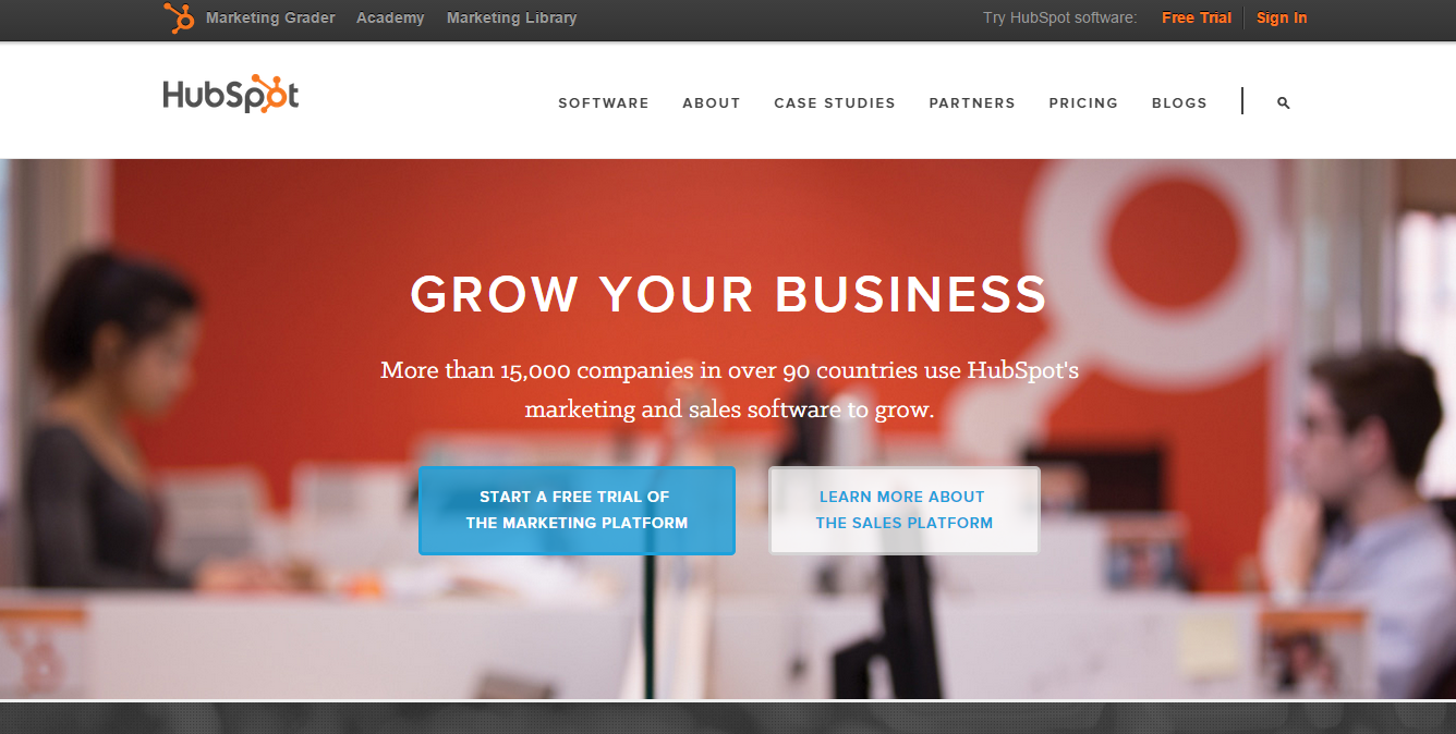
When it comes to employing multiple calls-to-action, it’s worth taking a look at the HubSpot.com website. HubSpot has a lot to offer and does a great job of grouping the content themes on the home page and using appropriate calls to action for free trials, resource downloads, and newsletter subscriptions.
This is probably overkilled for most small businesses, but the game plan is the same. Your calls to action may drive the bigger, more valuable actions, but if you’re capturing leads, you’re leaving money on the table.
Provide a Resource
If you’ve read anything about online content, content marketing, or search engine optimization you’ve probably seen several references to the creation of quality content.
Good quality content not only drives exposure through inbound links and social shares, but great content also builds trust with potential users by acknowledging their issues and providing solutions to them. Quality content should be the backbone of any website build and be treated as such with an adequate amount of time and resources invested in its creation.
Here, HubSpot should also get props, they’re very good at offering downloadable resources to users in exchange for their contact details. Also, HubSpot makes Case Studies and provides a wealth of free resources to their users. This creates a lot of exposure, links, and goodwill. When it comes to small business, this could be something like a Landscaping Company providing resources in the form of seasonal gardening guides, or a blog with gardening tips.
What Should You Take Away From This Post?
This small amount of guidance can save you a lot of headaches, heartaches, and time when you decide that it’s time to design a new company website.
If you only take some of my advice laid out above, let it be the allowing time for adequate planning and taking time out to understand your users and potential customers. Without adequate planning or knowledge of your users, converting prospects to customers will take more time, effort, and resources than required, which cuts into your profit.
Better yet, establish the success criteria for your new website, build a decent brief in conjunction with a trusted design partner, and let the professionals handle the details while you get back to growing your business.
Also, if you want to learn more, here is some additional reading I recommend on the subject:


