


[display-name-category]
[post_author]
Its been about a year now since Google announced that mobile use surpassed desktop use.
If your website is not optimized for mobile, you’re wasting a huge opportunity with these users that have forgotten that they own a computer.
Every time you want to know about the weather or need a beginner’s guide of Pokemon Go, you turn to your phone and Google it.
Today, we will discuss the basic guidelines for keeping your website optimized for mobile and tablets. Mobile optimization covers site design, page load, site structure, page speed, and responsiveness to make sure you’re not sending your potential clients away.
1) Let It load in a Flash
People want to find an answer right away. Once they click on a site, they want the page to load instantly. If your page takes more than 2 seconds to load, you having a slow mobile site.
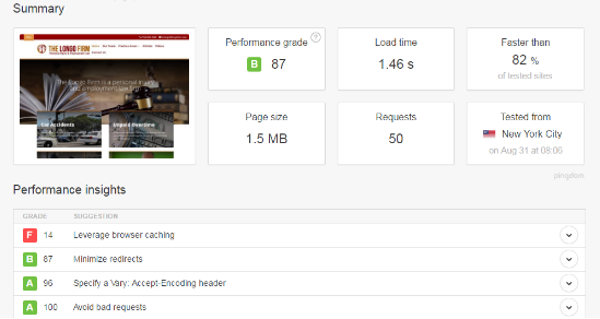
There are ways you can check if your page is loading as fast as Barry Allen (“The Flash”). One way is to use an online website speed test. Pingdom Tools offers a simple interface to test the load time of your website. Go to:

Then, enter your website URL and click on start test. After the test completes, you will have a summary like the one below that will give you advice such as to speed up your site.
2) Make Your Website Adapt to Mobile Devices
“Above the Fold” was a term used for desktop users to refer to the elements that should be at the top of the page before a visitor scrolls down on your website. Nowadays, this phrase has no power for mobile and tablet versions where we scroll endlessly.
Instead of creating a version for the mobile version and another version for the desktop version, now you can easily set up your website to detect the screen resolution of your device and adapt to the screen size.
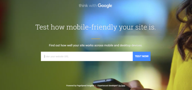
If you would like to test if your website is mobile-friendly, check the following Google URL:
Once you arrive at the page just enter your website URL and Google will give you insights.
3) Avoid the Use of Flash
Flash has cool effects and transitions but you might face the situation where the flash plugin is not available on a visitor’s phone. To avoid this, create your special effect using HTML5. It’s not fun when a new visitor arrives at your site just to find out that a video is not available because the device is not supported.
Remember that user experience is what will bring new visitors to your site and returning visitors will spread the word of how beautiful or stressful your website is
4) Kill the Pop-Up
Pop-ups are not recommended for the mobile version. I personally don’t like it when I enter a website and a pop up interrupts – and I can’t even close it. To avoid this type of frustration, remove any pop-ups, even if they are coded as “responsive pop-ups”.
The best way to find out if you need to get rid of a pop up is by using heatmaps. We personally recommend the use of Hotjar because it provides a lot of tools besides heatmaps.
Here at White Shark Media, we ran a client’s website with a pop-up feature for about a month just to find out that from 1, 482 taps recorded in the site, 35% of the taps were used to close the pop-up message.

5) Design for the Fat finger
Make sure buttons, links, and call to actions are big enough so users with big fingers can easily click them and interact with them. It’s frustrating when you access a site and all interaction buttons are placed together and you use all your fingers to touch the right button.
As you can see below, we foresaw this possible scenario for one of our clients “Lakeland Smile Experts” and provided enough space between buttons. 
6) Always Optimize for Local Search
7) Content Size Matters
The content size of the page actually matters. Why? Mobile screen resolutions are smaller than desktop screen resolution. When creating content for mobile devices you need to keep it simple, short, and direct.
8) Call To Action

9) Use Javascript and Images
Ready to Optimize Your Mobile Site?
Remember to use these tips provided today and you will see the difference in your website. If your website is mobile-friendly, you can double-check the tips and implement them, if not we believe these simple tips will help you build an optimized mobile website.
Do you know another tip to optimize your website?


